Football Kit Fever 2026/27: The 10 Most Hyped Jerseys Ranked
From Barcelona’s rainbow stripes to Arsenal’s golden arms – which club scored a style goal?
The transfer window is still open, but the real blockbusters have already dropped – the new kit collections. Some releases went more viral than actual player signings. We've witnessed AI bringing 1989 legends back to life, campaign films shot like Hollywood road movies, and a match shirt priced at nearly €200 that sent fan forums into meltdown. And then there's Arsenal: after ending their 22‑year Premier League title drought, they've decorated all three of their jerseys with gold champion badges – an unprecedented move in the club's history. Today's football shirt is no longer a simple uniform; it's a fusion of nostalgia, cutting‑edge tech, pricing psychology, and a fierce battle for eyeballs.
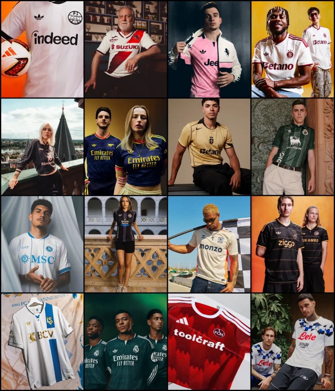
We've selected the 10 most talked‑about releases from Europe's top flight – ranked by online buzz and international media attention, not by subjective taste (so feel free to argue in the comments). Each club's home and away kits are featured, along with global reactions. Let's uncover which brand transformed a piece of fabric into a commercial statement.
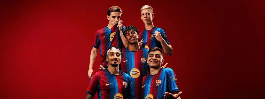
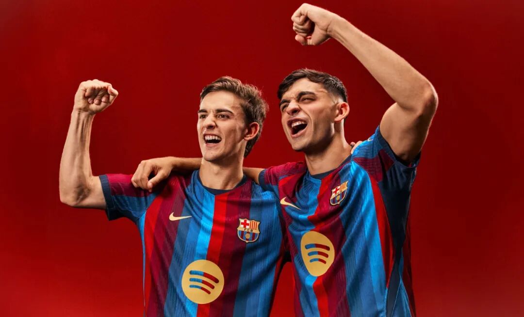
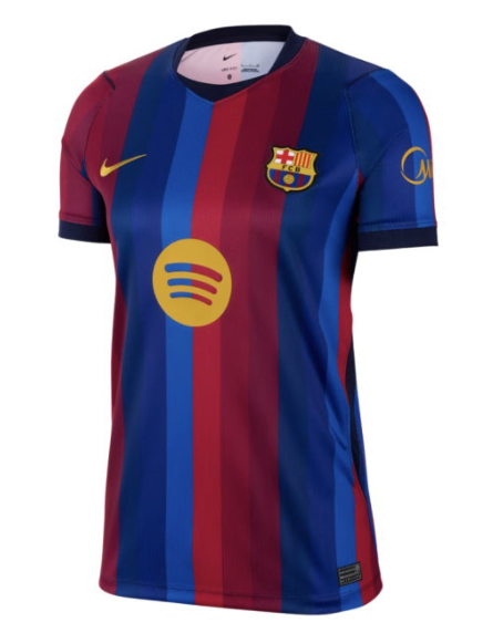
Home ✅ Debuted 30 June, hit shelves 1 July: A vertical six‑colour stripe – three reds alternating with three blues – drawing inspiration from the newly refurbished Spotify Camp Nou façade. It's a modern reinterpretation of the 2006/07 "Dream Team II" look, with a striking mineral‑yellow Swoosh. The launch at MACBA museum and the use of exclusive custom fonts made it an instant collector's item.
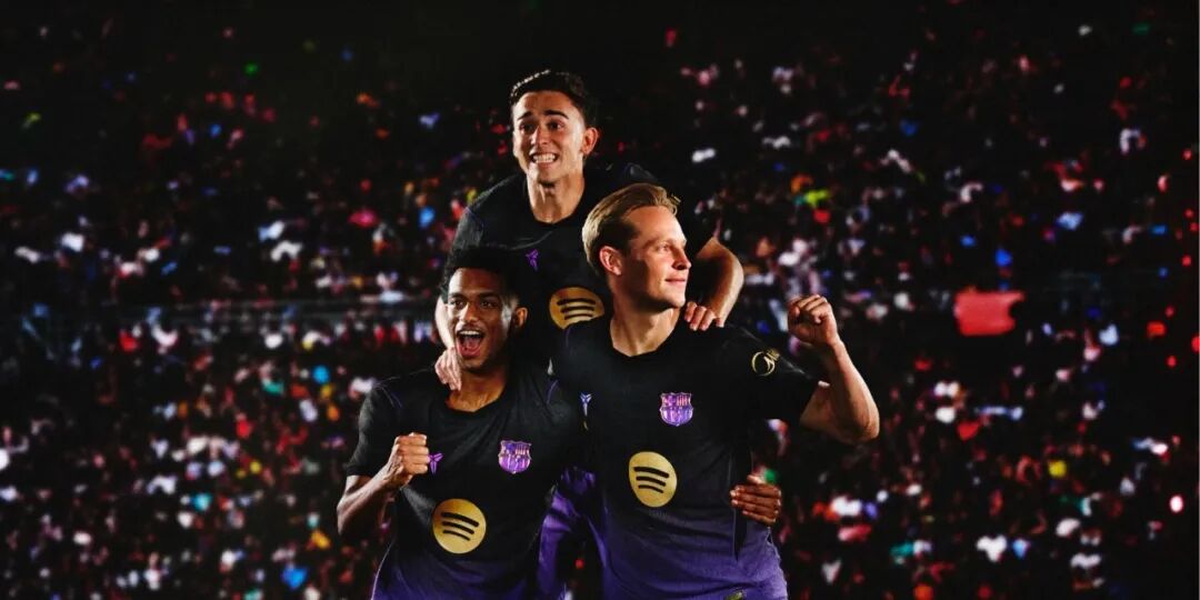
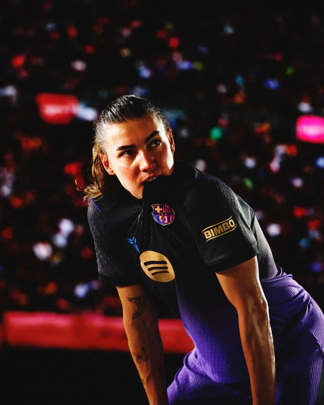
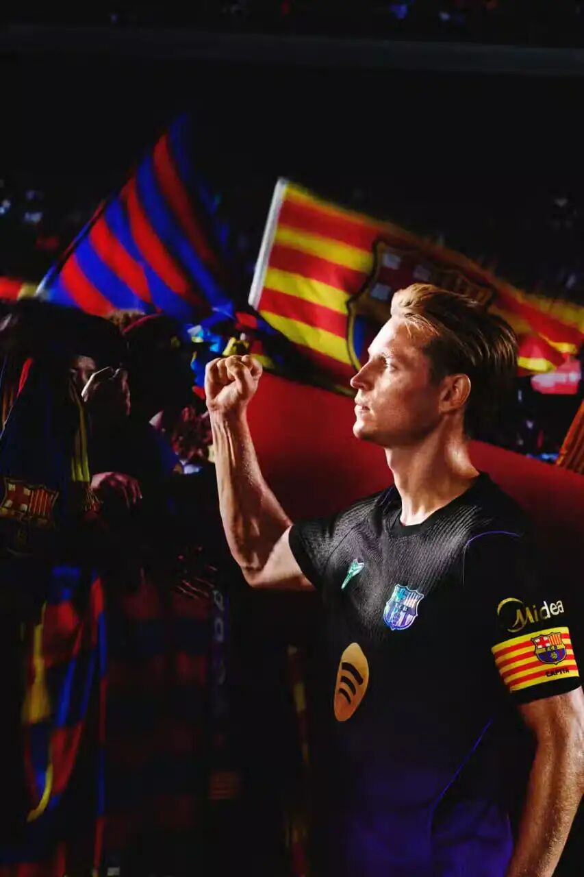
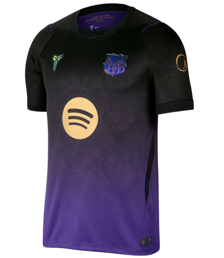
Away – a powerful homage to Kobe Bryant's "Mamba" spirit: purple and black with gold highlights. Inside the collar, a motivational mantra: "Leave the game better than you found it."
Why it's trending: Visual controversy + price outrage – no other jersey split opinion so fiercely.
Global verdict: Footy Headlines noted that "Barcelona used more shades of red and blue than any previous home kit". The €200 price tag for the player‑version sparked fury, yet it became the season's most debated shirt.
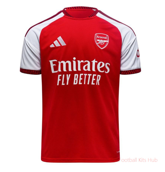
Home ✅ Unveiled 14–15 May: Classic red‑sleeved white body, but now in a "redcurrant" hue that recalls the 2004 Highbury farewell. The round neckline takes its curvature from the Emirates Stadium's roof. The biggest news? Gold Premier League champion patches on both sleeves – a club first in their entire history.
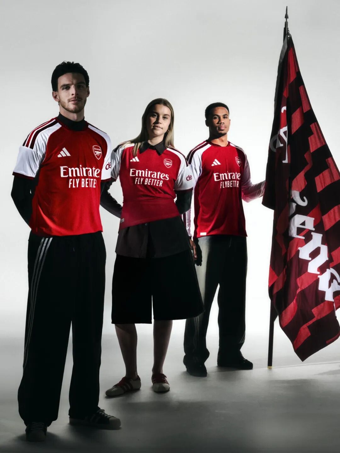
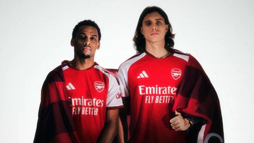
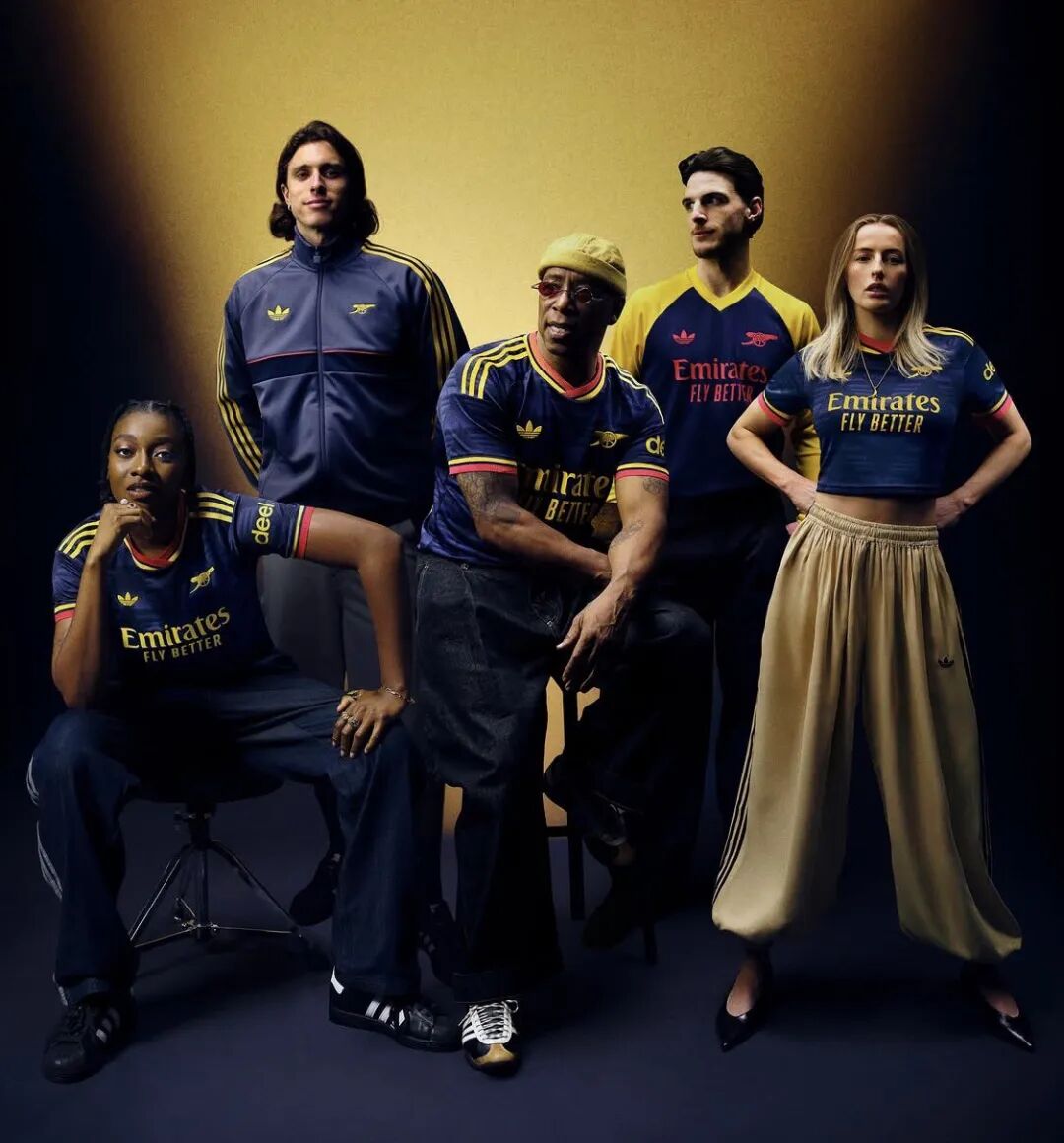
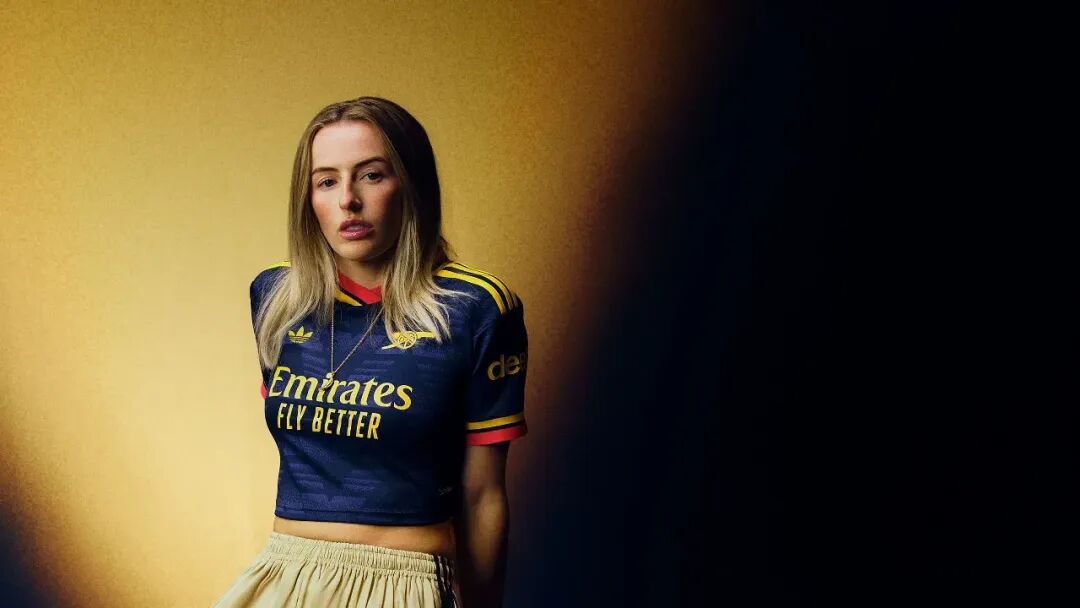
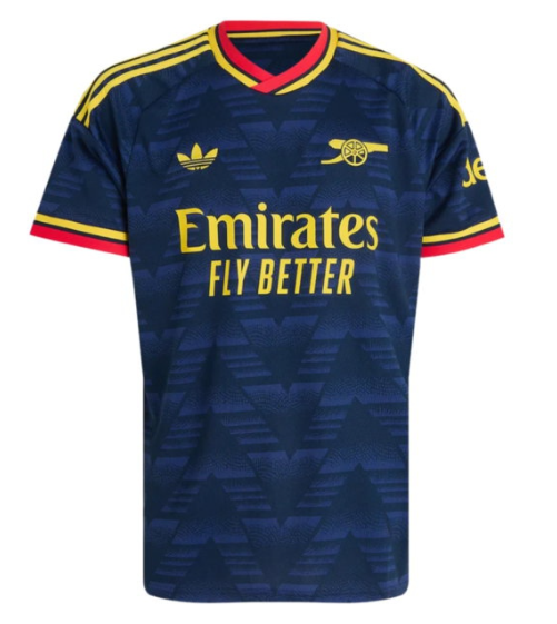
Away – the legendary "bruised banana" 90s pattern returns in an inverted colourway: navy base with vibrant yellow and red accents, plus the adidas Originals trefoil logo.
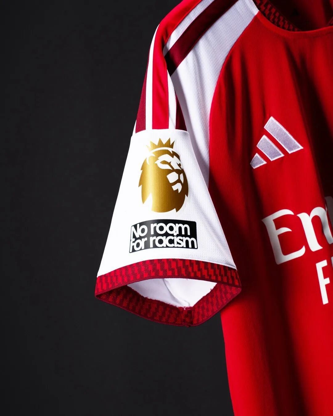
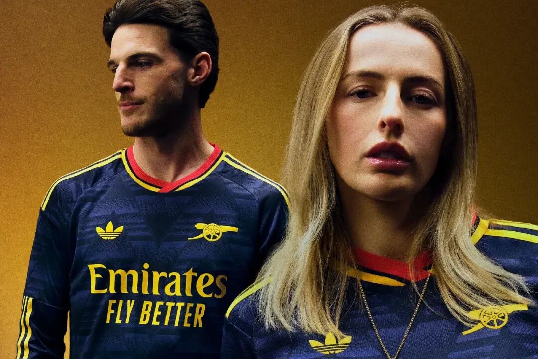
Why it's trending: After 22 years of waiting, the gold patches are a tangible symbol of redemption and glory.
Global verdict: GiveMeSport rated the home 8th ("not flashy, but unmistakably Arsenal – exactly what a home shirt should be"); SPORTbible scored it 7.5/10; ESPN, however, ranked the away among the bottom 10 of all releases – a genuine love‑or‑hate design.
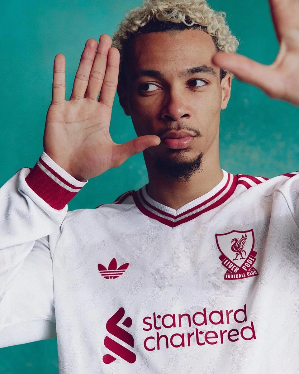
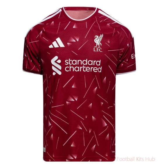
Home ✅ Released 19 May: A faithful revival of the 1989–91 "Candy" shirt – deep red with the iconic triangular speckle pattern. The promotional campaign used AI to digitally resurrect four 1989 legends (Rush, Barnes, Grobbelaar, Hansen) alongside current players – a brilliant blend of technology and heritage.
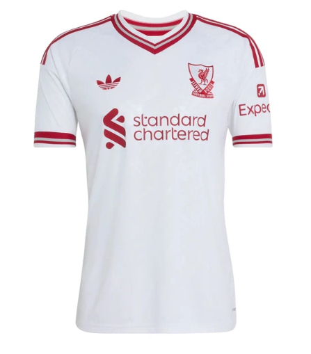
Away – crisp white with maroon logos and the adidas Originals trefoil replacing the standard performance badge. A clean, timeless design.
Why it's trending: Tech‑fueled nostalgia – the most explosive marketing move of the off‑season.
Global verdict: SPORTbible awarded 9/10 ("a superb remake of the 1989–91 classic"); ESPN placed it 4th; GiveMeSport listed it in the top 11. The only criticism: the red appears darker than past versions – Footy Headlines described it as "maroon".
Home – traditional azure blue, but the away kit is the real headline.
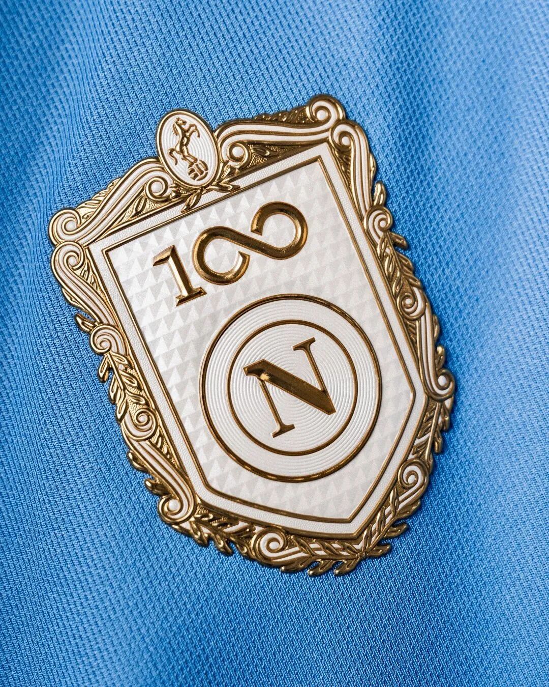
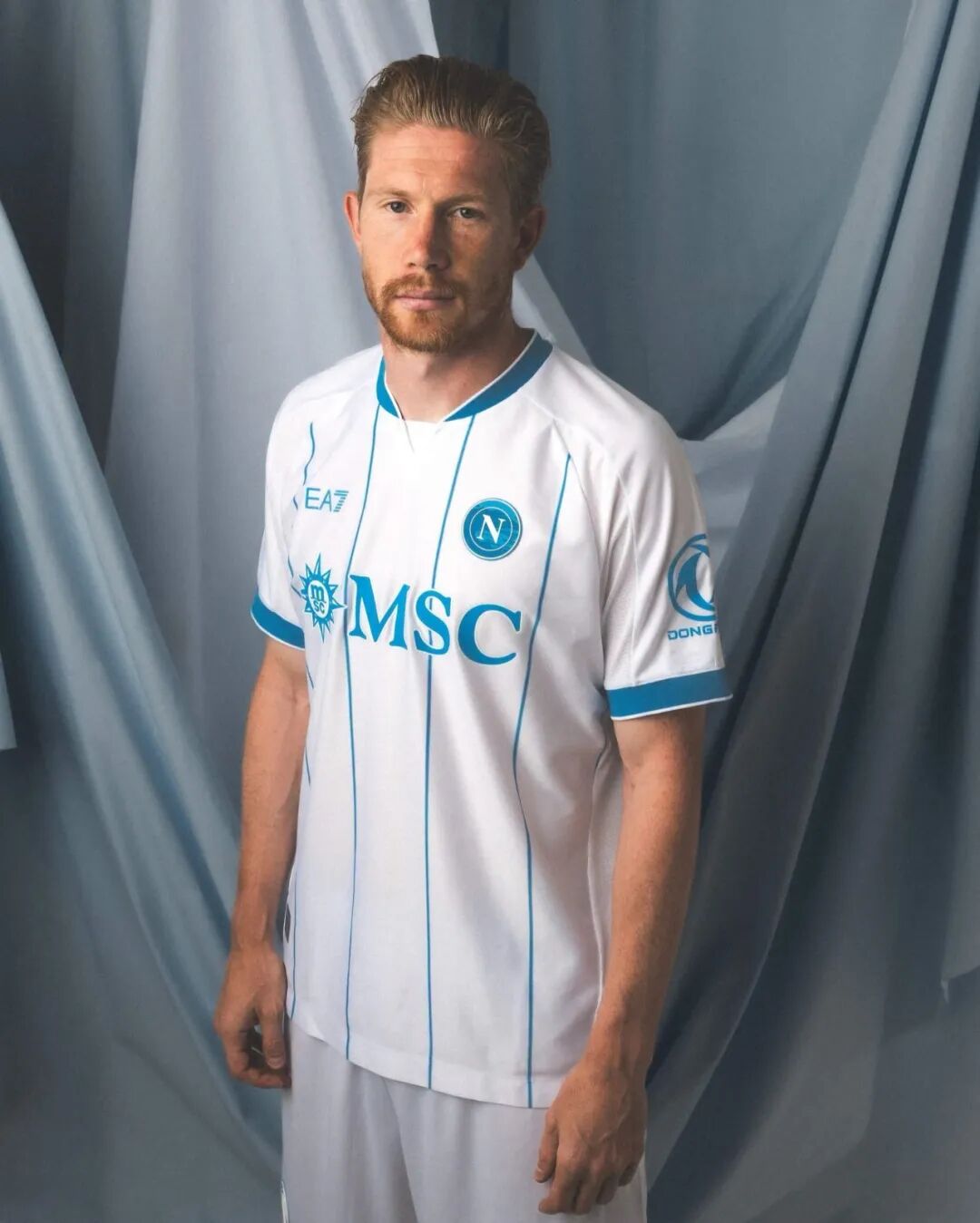
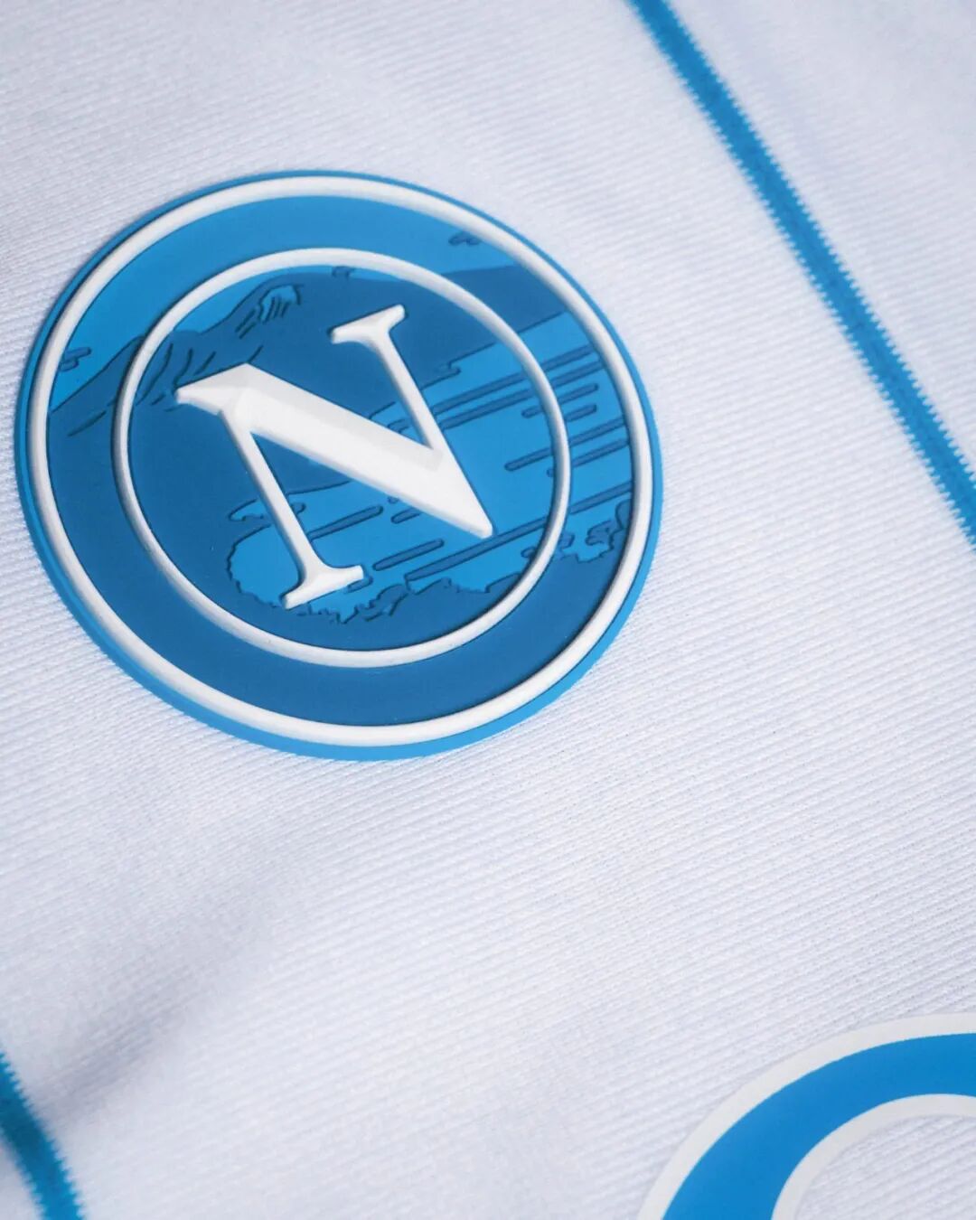
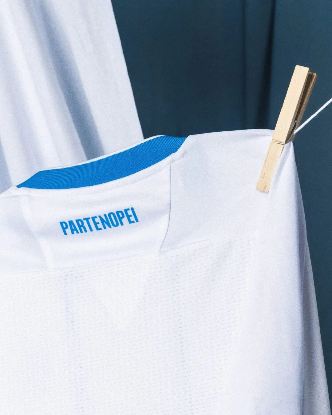
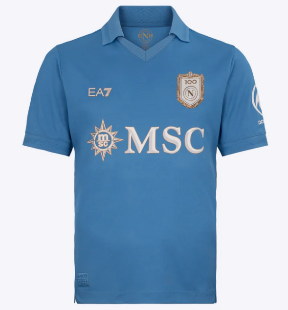
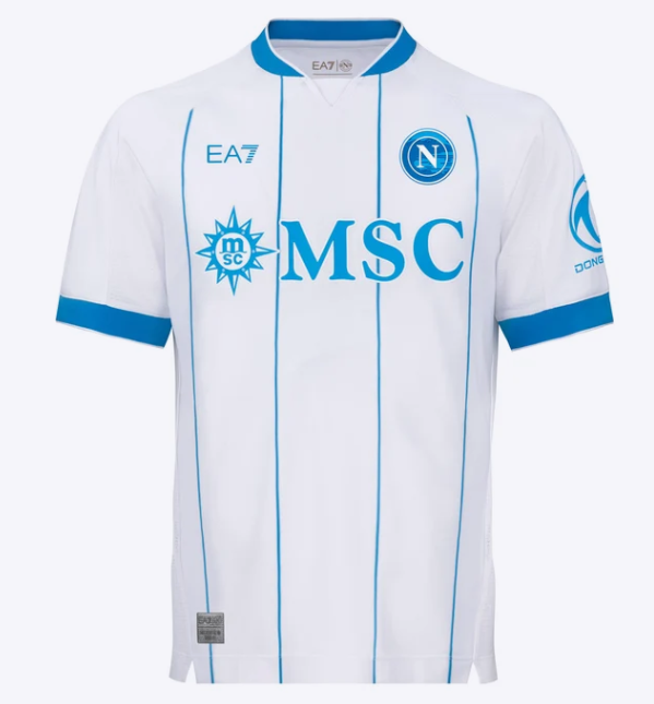
Away ✅ Dropped 23 July: Elegant white with Naples‑blue accents. The crest is superimposed on a silhouette of the Gulf of Naples and Mount Vesuvius. The campaign was filmed in Buenos Aires (La Boca, Caminito, Casa Rosada), weaving together stories of migration and Maradona's eternal bond. An NFC chip inside unlocks digital content – all part of the club's centenary celebrations.
Why it's trending: A single away shirt captures the essence of the city – migration, Maradona, and the Gulf.
Global verdict: Called "the most narratively ambitious launch of the summer" – stitching three stories into one jersey.

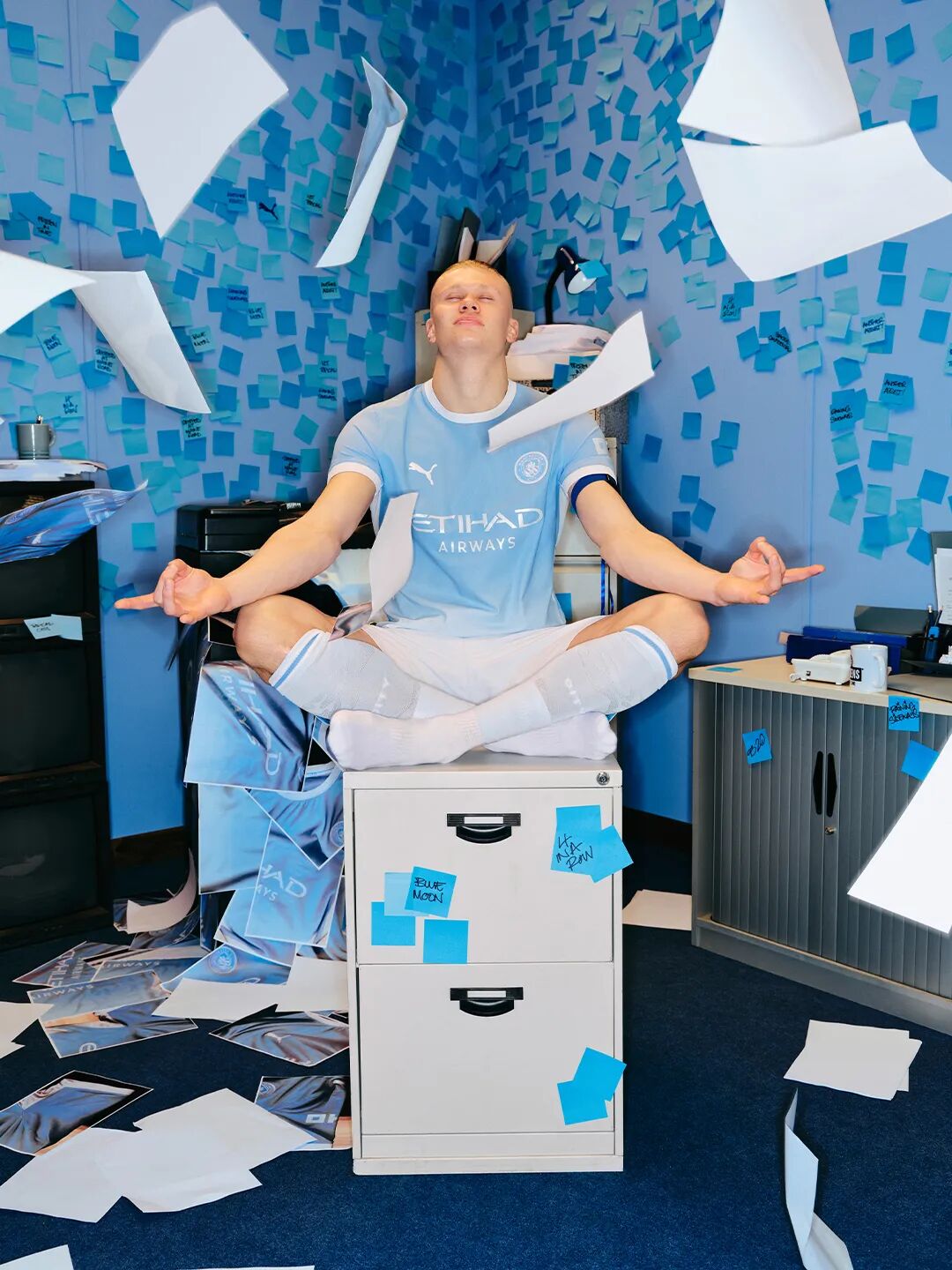
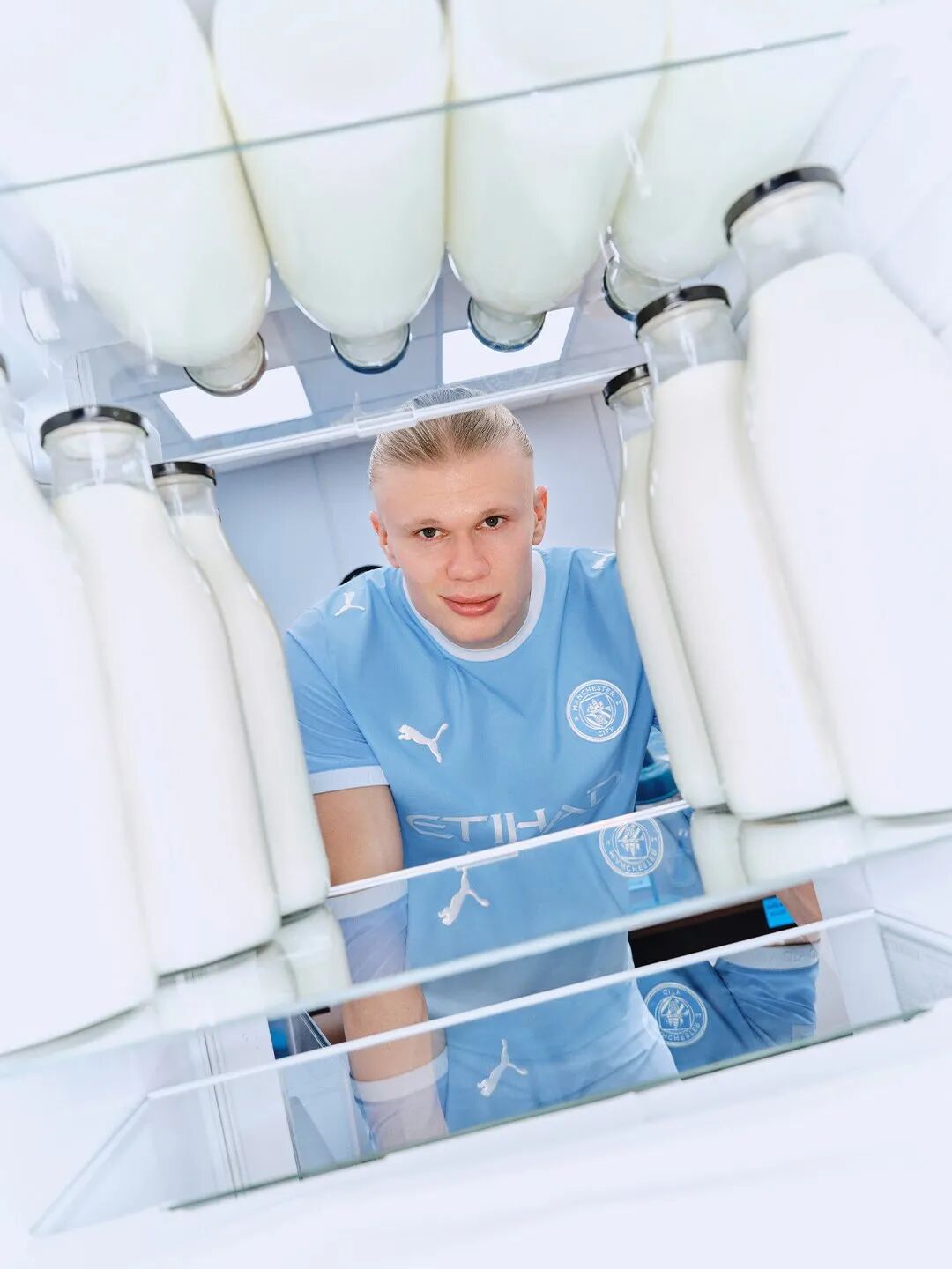
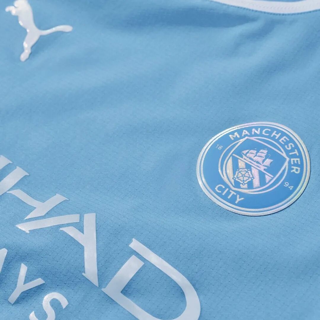
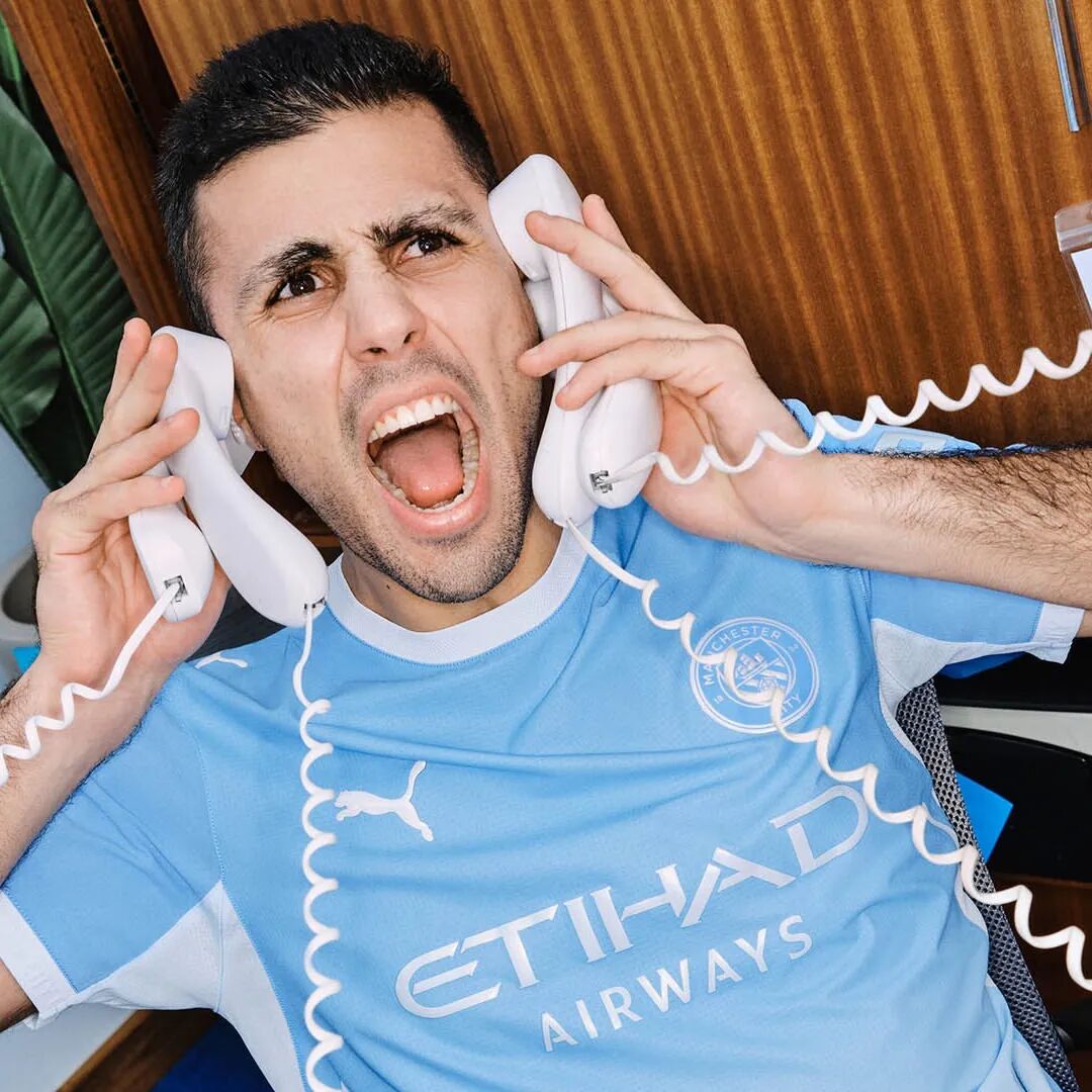
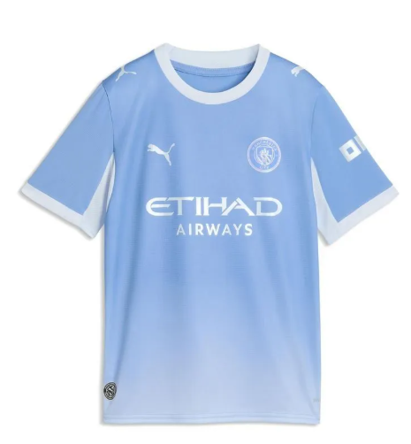
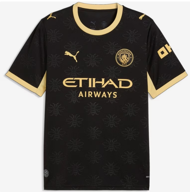
Home ✅ Unveiled 20 May: A continuous sky‑blue gradient that fades from dark to light from shoulder to hem. Monochrome metallic badges and sponsor logos give it a sleek, high‑end finish. The launch video was a street‑comedy short – a deliberate break from conventional sports marketing.
Away – a bold, contrasting design that flips the sky‑blue script, built for European night matches.
Why it's trending: "Not Your Typical City" – and they absolutely delivered.
Global verdict: GiveMeSport ranked the home 6th, praising its "fresh and distinctive" aesthetic.
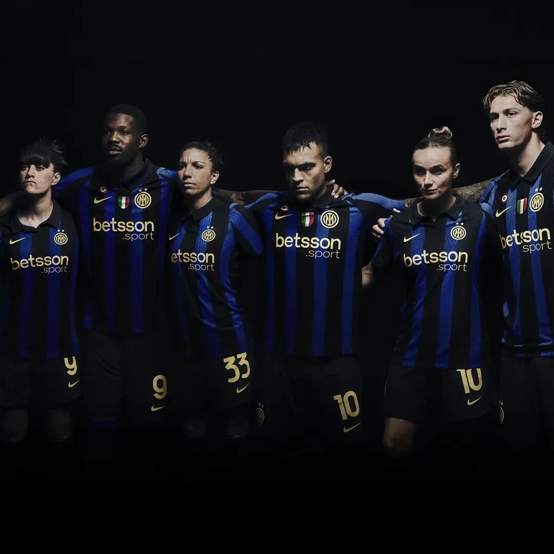
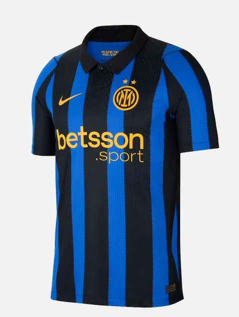
Home ✅ Debuted 19 May: Black and Lyon‑blue stripes paying tribute to the 1998 classic. Gold detailing, a retro collar, and "Made of Milano" printed inside the neck. The stripe edges mimic tailor's shears – a direct nod to Milan's fashion‑district roots.
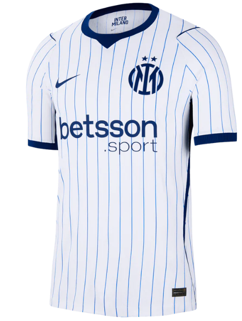
Away – baseball‑inspired: white with light‑blue pinstripes. For the first time in over a century, the traditional crest is replaced by an "IM" monogram – pure streetwear energy from the fashion capital.

Why it's trending: The spirit of Milan's couture quarter is woven into every stripe.
Global verdict: Design critics rated Inter's kit among the "most cohesive" – the "Made of Milano" theme became a benchmark for city‑identity jerseys.
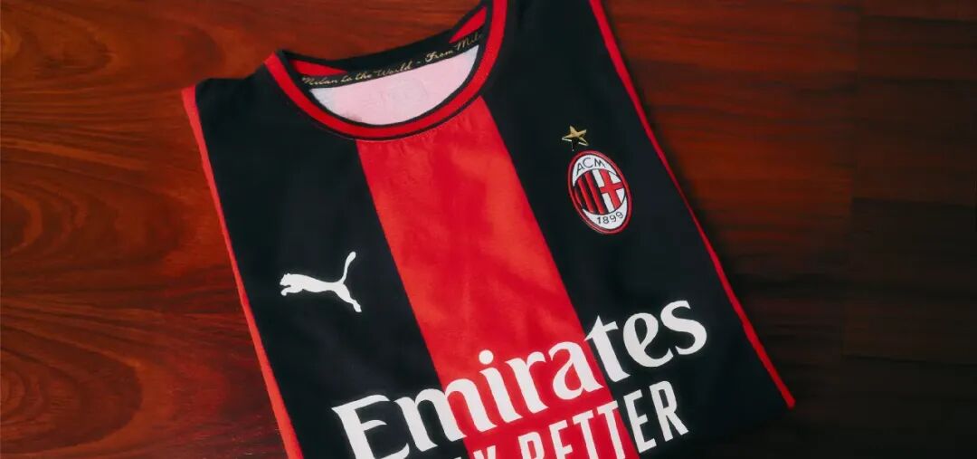
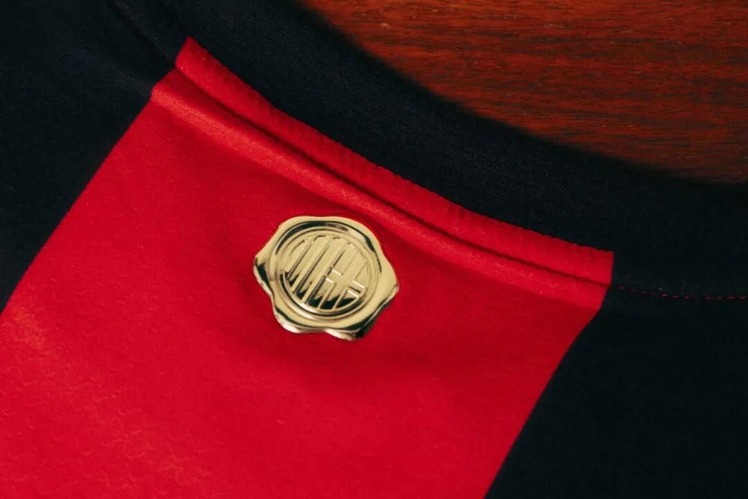
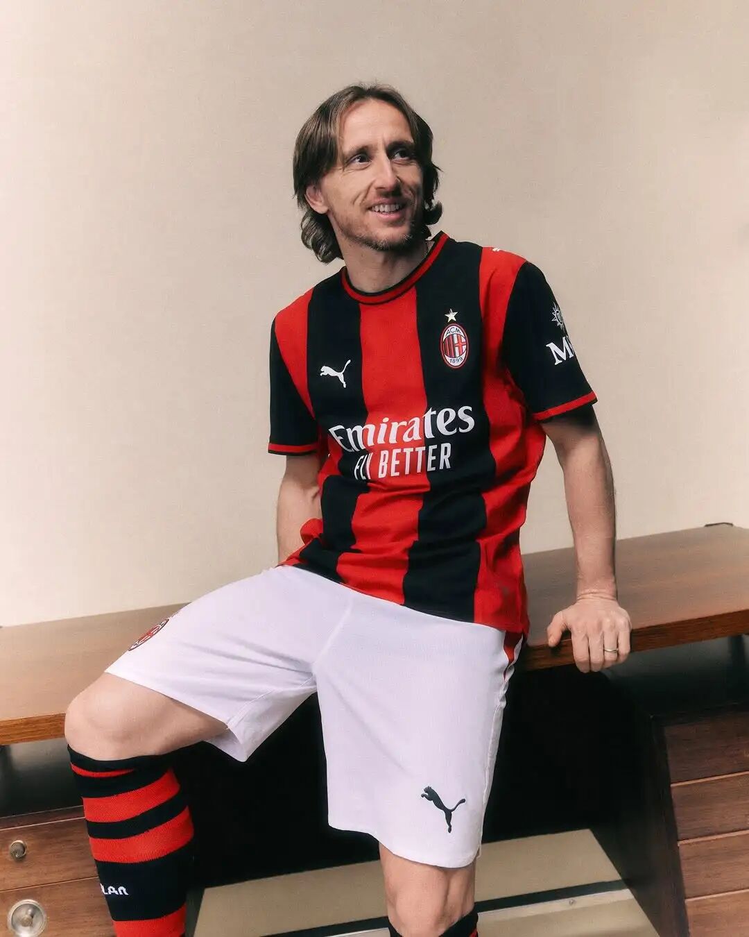
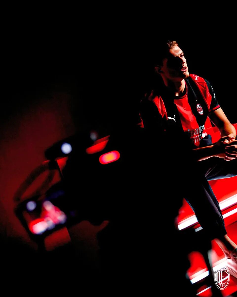
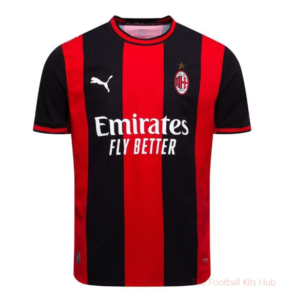
Home ✅ Unveiled 22 May: Bold, wide red‑and‑black stripes that run all the way to the back. A wax‑seal crest on the nape bears the motto "From Milan to the World".
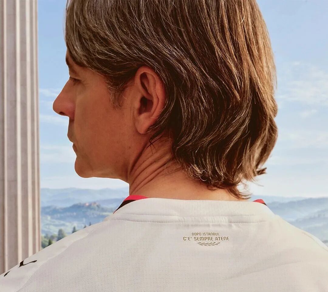
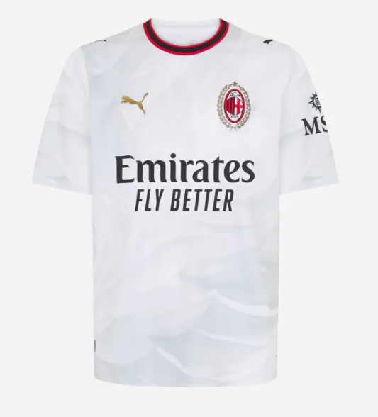
Away ✅ Launched 21 July: White with light‑grey pinstripes, and a gold laurel wreath surrounding the crest – honouring San Siro's 100th anniversary. Filippo Inzaghi starred in the campaign, and the collar carries the phrase: "Dopo Istanbul c'è sempre Atene" (After Istanbul, there is always Athens).
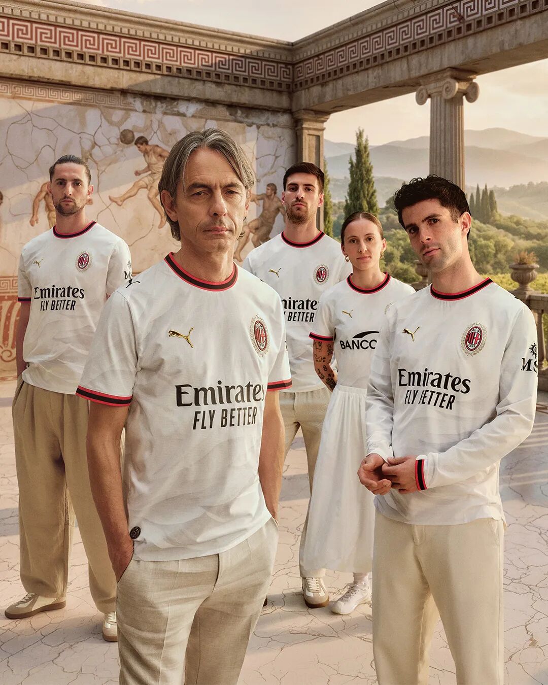
Why it's trending: "Revenge" and "rebirth" stitched into the collar – pure emotional storytelling.
Global verdict: Football Italia described the away as "a journey from ashes to Athens"; the gold laurel was hailed as a "welcome return to gold detailing".
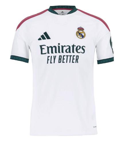
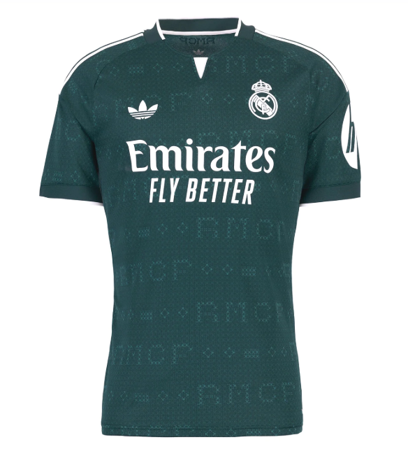
Home ✅ Dropped 3 June: All‑white with dark‑green and pink accents. The subtle graphic is inspired by the diamonds and pearls on the crown of the club crest. And the three stripes on the shoulders? Bright pink – a daring break from tradition for the most traditional club in football.
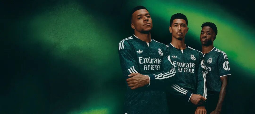
Away – deep green with off‑white accents, featuring a geometric monogram that spells "RMCF". The adidas Originals trefoil replaces the standard performance logo – a sophisticated touch.
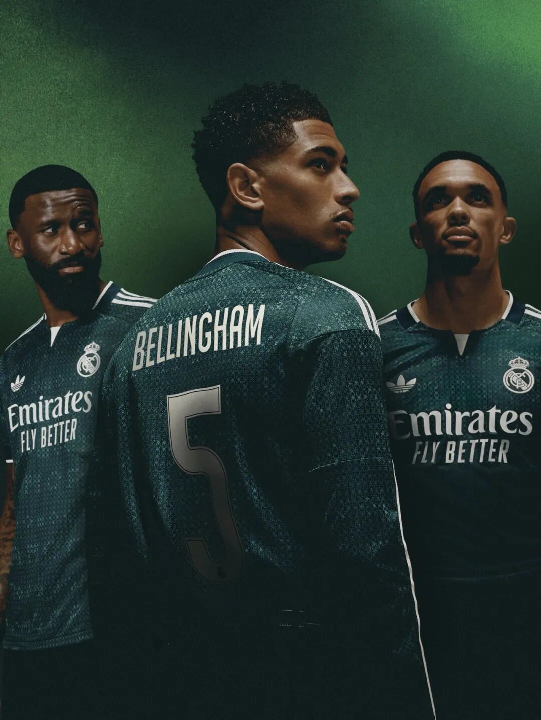
Why it's trending: When the most "proper" club dares to go pink, it's guaranteed to make headlines.
Global verdict: The pink‑striped home sparked worldwide discussion; the trefoil away was called "a collector's dream".
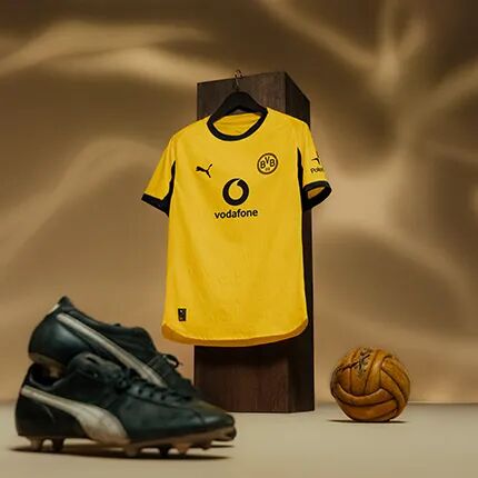
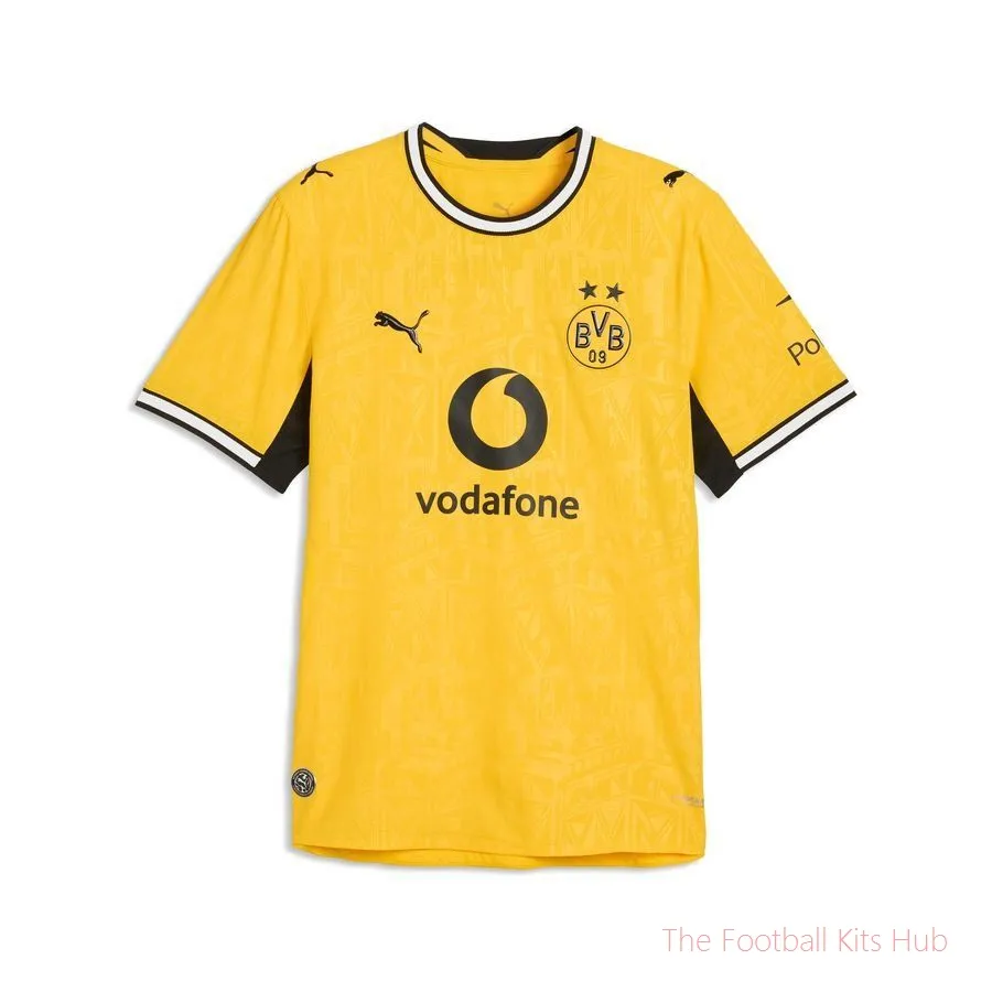
Home ✅ Unveiled 7 May: Yellow‑and‑black base with a tonal geometric print across the chest and lower body – drawing from the steel structures of the Ruhr mining region and Dortmund's U‑Tower (commemorating 40 years since the mine closure and the tower's centenary). Vodafone appears as the new front‑of‑shirt sponsor.
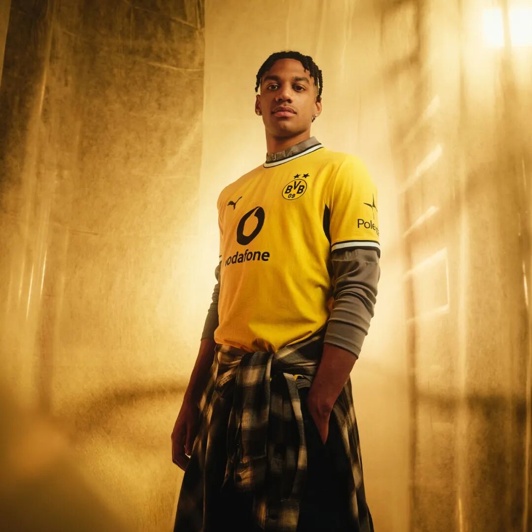
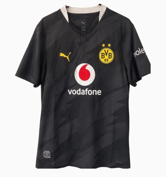
Away – a more restrained, elegant design compared to last season's grey‑and‑white. Clean lines and a sophisticated colour palette – German media praised the shift from "loud" to "cultured".
Why it's trending: Industrial heritage meets modern design – the shirt tells the story of a city's transformation.
Global verdict: German outlets highlighted the away's "elegant restraint", a complete 180 from the previous season's polarising look.
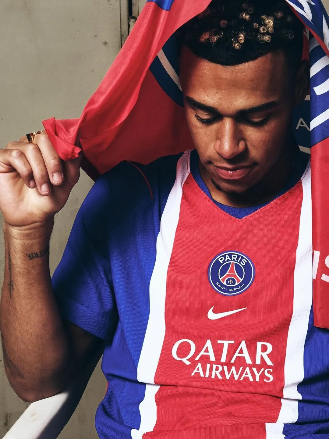
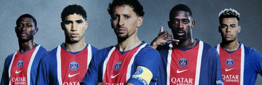
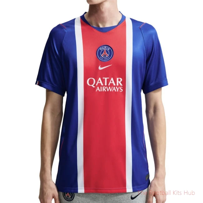
Home ✅ Debuted 9 May: A lighter, brighter "Old Royal" blue – the classic Hechter central red‑and‑white stripe is wider and, for the first time, continues onto the back. The crest and Swoosh are vertically centred, sparking plenty of debate.
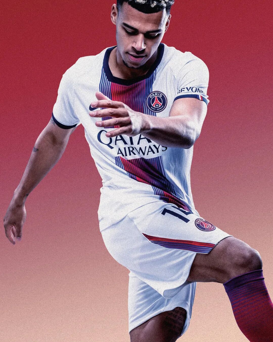
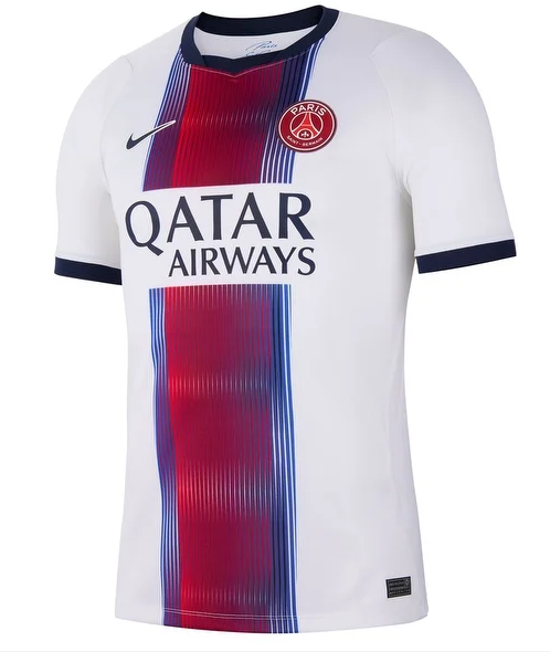
Away ✅ On sale 11 July: White base with a central vertical gradient (red to navy pinstripes), inspired by Op Art and Paris's electronic music scene. The lenticular crest changes colour as light hits it. Nike's "RIP the Script" campaign (featuring Kim Kardashian) amplified the hype.
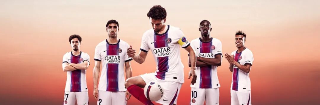
Why it's trending: From retro blue to optical‑illusion away – PSG turned kit design into a creative lab.
Global verdict: GiveMeSport ranked the home in their "Top 10 of the season"; Footy Headlines called the lenticular badge "an optical experiment".
The above ranking highlights the 2026/27 new‑season kits from Europe's elite, ordered by online conversation + international media coverage – not purely on design merit. Sources consulted include ESPN, GiveMeSport, SPORTbible, Footy Headlines, Football Italia, and others.
Naturally, everyone has their own personal top 10. Some love retro classics, others crave boundary‑pushing innovation. Some are moved by a pattern, a badge, or a city's narrative – others simply recall the shirt they wore when lifting a trophy. A kit is never just a kit; it carries a club's history, beliefs, and character – and it serves as another language for fans to express their devotion.
The new season is just around the corner. Whether these jerseys become timeless icons will be decided by time, results, and the stories yet to be written on the pitch. Drop your favourite in the comments – let's settle who truly takes the "crown of beauty".